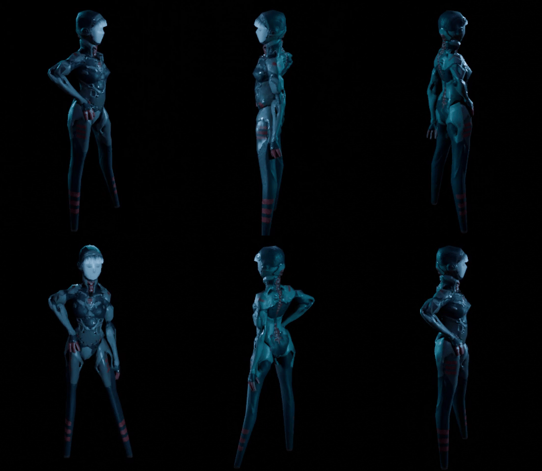
Been working on a few things since the last update, the main focus ended up being the mapping and finding a direction I liked with that, but I also gave Eve a bit of a glow up.
When it came to in-engine tests it became apparent that Eve just wasn't fitting in with her current texture, largely because of the way I had been creating the textures for the maps. I know generally it's assumed PSX styles typically don't include mesh maps like roughness, metallic or normal, but I love these texture maps too much to part with them :)
Anyway, say hello to Eve 2
I'm interested in exploring a various resolutions for textures, so I made 3 versions with different maps starting from as high as 512px to 128px.
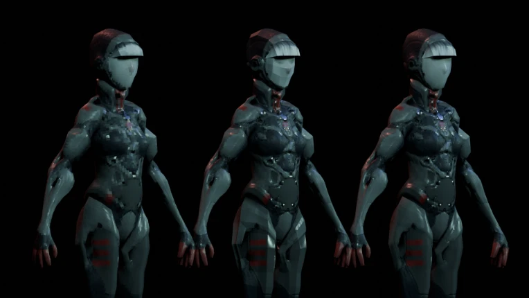
128x128 256x256 and finally 512x512
Mapping
In the interest of saving time I spend a little while putting together some terrain tiles that I can use freely and layout however I wanted, but to get this stuff rolling I started by putting together a simple tilesheet for the interior.
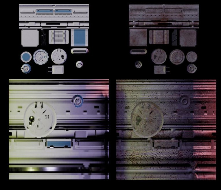
(anyone who knows me is probably sick of me talking about tilemaps, if you're one of those people..get used to it :)))))
It's nothing fancy and I'll likely change more than a few things, but it's a good starting point for this project.
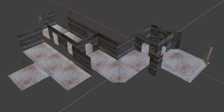
Plus it tiles way better than I had actually expected, I'm excited to see what more I can make from it. This tile map is actually the main reason I updated Eve, because her texture before just wasn't interacting with the lighting of the scenes as I had hoped, I tried altering the original texture, but in the end I just went and baked from a high poly mesh to a super low resolution, the same way I had done with the tilesheet.
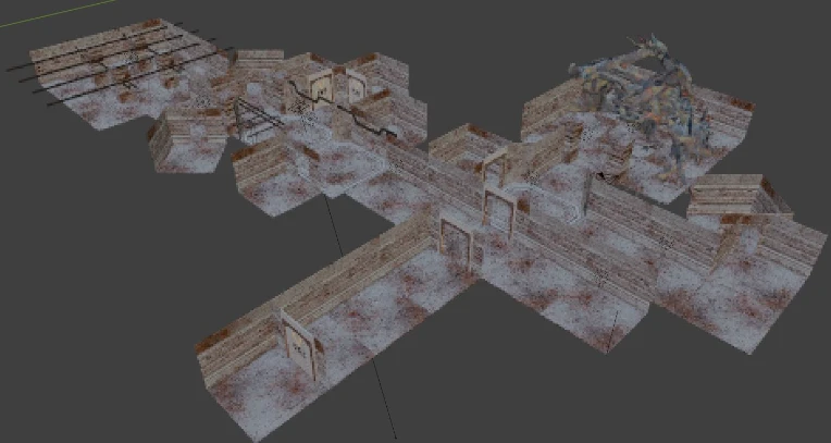
Large map
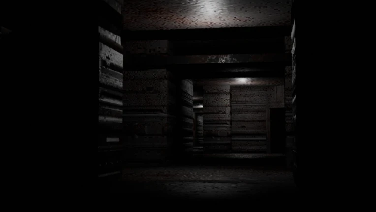
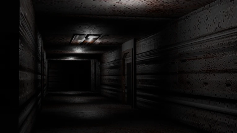
Super spooky interior lighting.
Anyway, that's that for that little (lots of "that's") update.
Current goal is refine the mapping side of things, and continue to work on getting it stuck in-engine.
(also if you hadn't guessed yet, yes I am a massive fan of Signalis)